A travel preparation app designed to reduce the stress of packing and planning - so you can focus on the trip itself.
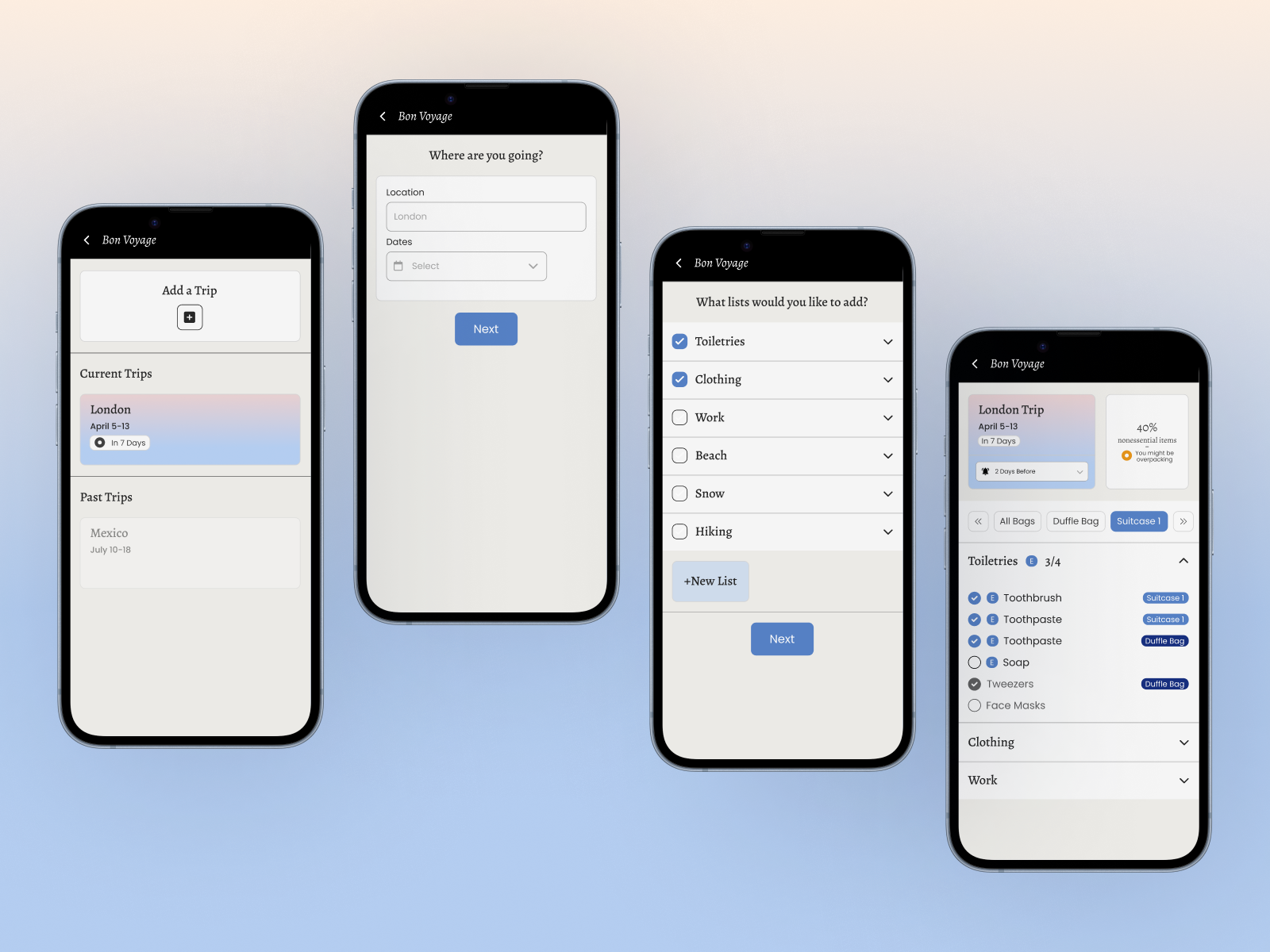
Traveling should be exciting, but for many people, it's a hassle. Between packing lists, booking tasks, and the nagging fear of forgetting something important, the preparation process takes up time and energy, especially for people who are disorganized, over-planners, or managing a busy life.
Bon Voyage is a mobile app concept designed to take the stress out of trip preparation. The goal was to design something more than a checklist app - something tailored for the target user: someone who finds packing stressful because they are disorganized and tends to overpack.
Packing and trip preparation involves managing multiple categories of tasks - things to pack, things to book, and remembering where each item is.
Existing apps addressed parts of this problem. What none of them did well was account for the different types of anxiety travelers bring to the process. Some users fear forgetting things and some fear overpacking.
I conducted user research to understand the range of travel preparation experiences and identify the core frustrations people carry into a trip.
Users made lists but lost track of them, or procrastinated until the night before and packed under stress.
Group travelers were managing packing across family members through text threads and shared notes apps, tools not built for the job, leading to gaps and duplication.
Over-packers described a genuine fear of under-preparing, with no system to reassure them they had covered the essentials. The anxiety was about completion, not just remembering items.
A fourth pattern emerged among frequent travelers: repetitive effort. People who travel often found themselves rebuilding the same lists from scratch for every trip, with no way to create reusable templates. The tool was making a familiar task feel new every time.
Four distinct user types emerged from the research, each with a clearly different relationship to travel preparation. Rather than treating these as decorative archetypes, I mapped each persona directly to features, keeping every design decision tethered to a specific user need.
Sasha's persona was the most interesting to design for. Her problem wasn't lack of organization, it was lack of reassurance. The design needed to communicate completion, not just track it. Designing for her edge case ultimately made the product better for everyone: if the completion indicator works for someone who checks everything three times, it works fine for someone who checks once.
Before sketching, I audited the two most-used packing apps on the market to understand where the gap was and what the design needed to do differently.
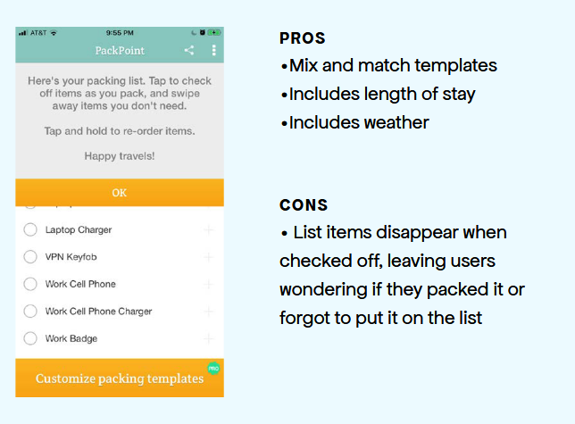
PackPoint offered smart list generation based on trip length and weather. But checked-off items disappeared entirely from view, which removed any sense of progress and made it impossible to review what had already been packed.
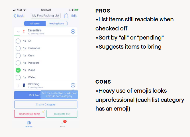
Pack List kept items visible after checking and offered sorting between "all" and "pending". But heavy use of category emojis made the interface feel casual in a way that undercut trust for users managing complex, multi-person trips.
No existing app combined smart list generation with a completion-oriented interface that worked for both anxious packers and casual users.
I began with paper prototypes across five key screens: the loading screen, trip creation, activity selection, the packing list, and the map view.
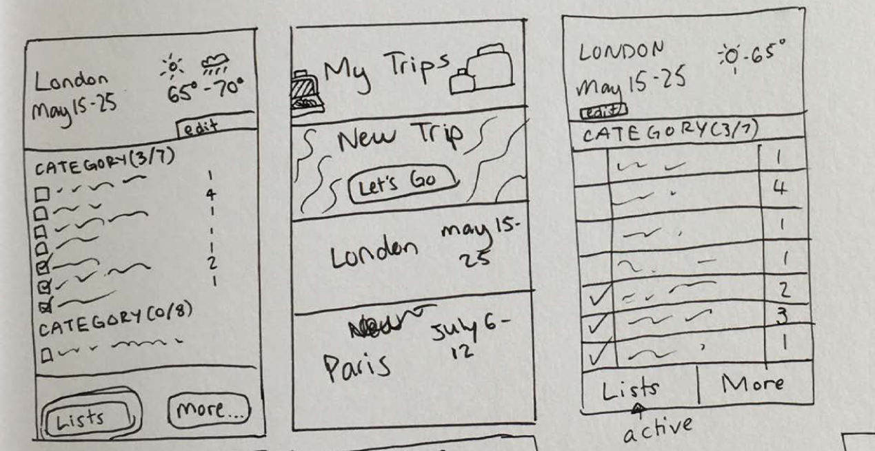
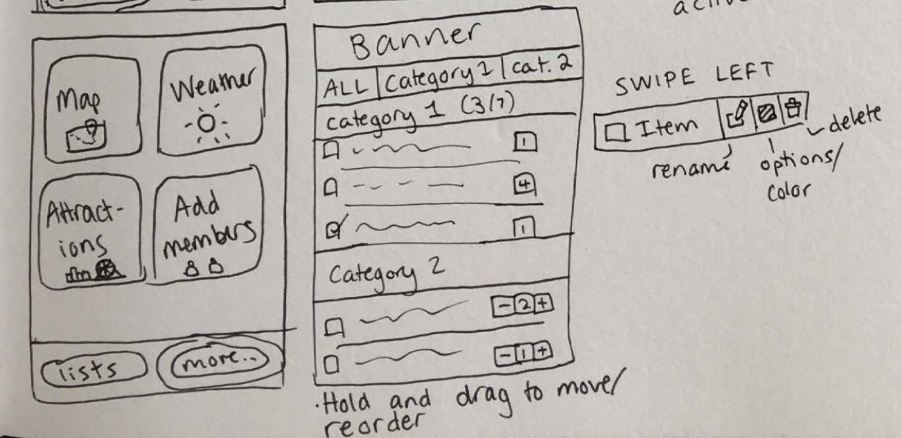
Early user feedback on the prototypes was direct and useful. The most consistent piece: the "New Trip" button was occupying prime screen real estate, pushing existing trips below the fold. Users wanted to see their current trips first. The app should orient around where they already are, not where they might go next.
I also heard that buttons needed clearer affordances. Text labels alone weren't enough; icons were expected alongside them.
I incorporated this feedback into a revised set of wireframes and built a higher-fidelity prototype in Axure.
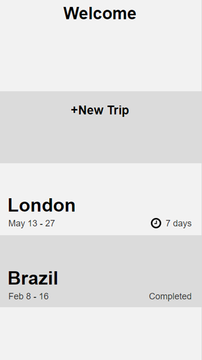
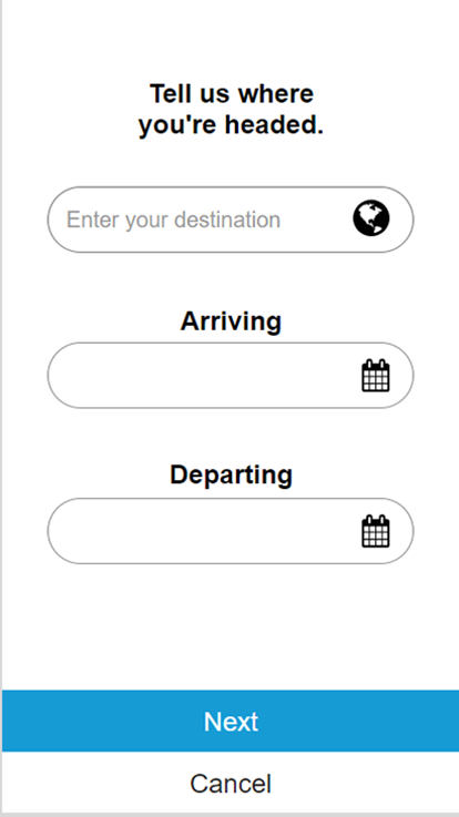
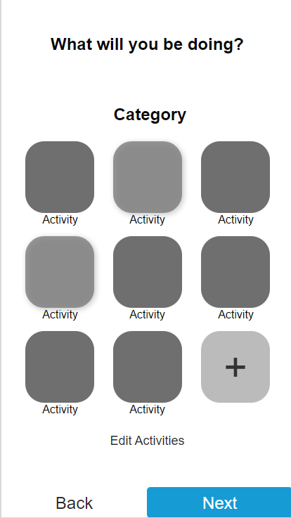
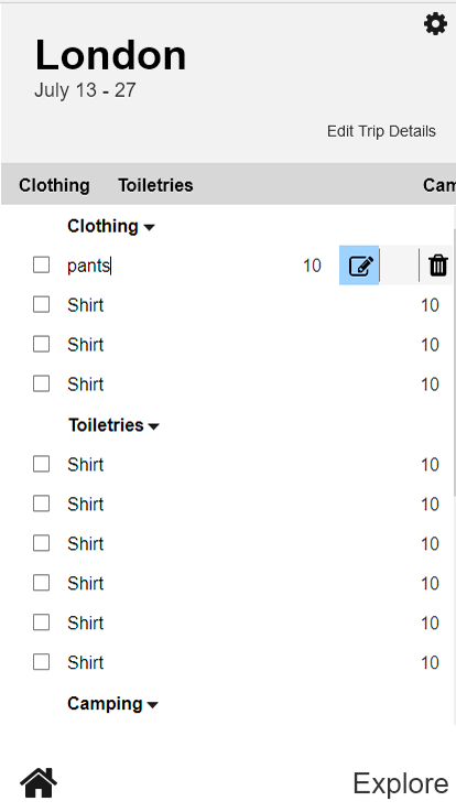
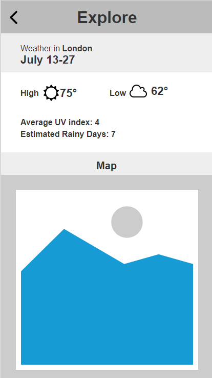
A second round of feedback identified a visual problem: the dark header, dark "Current Trips" bar, and the deep blue location image on the home screen created too little contrast between sections. The color system also didn't evoke travel - the palette read as a generic utility app rather than something belonging in the context of anticipation and adventure. I flagged this as a priority revision for the next iteration.
Each design decision was traced back to a specific persona need. Three decisions shaped the core of the product.
For Sasha's persona specifically, I introduced a two-tier list system: items could be marked as essential or supplementary. The visual completion indicator only triggered when all essential items were checked, giving her the reassurance she needed without requiring perfection from everyone else. Users who didn't care about the distinction could simply ignore the tier and use it as a flat list.
Frank's problem was coordination, not memory. The master list model, where one person owns the canonical version and changes propagate to everyone else, was borrowed from how document collaboration tools work, applied to packing. This gave the group a single source of truth without requiring everyone to check in constantly.
Rather than forcing every user to start from scratch, the app generates a baseline packing list from trip inputs: destination, length of stay, weather, and selected activities. Users edit from there rather than building from zero. This directly addressed both Lilly's need for reusable starting points and Eric's tendency to procrastinate on list-building altogether.
This project was my first time taking a design from research through to a working prototype. With more experience, I would approach two things differently.
Specifically task completion time and error rate data during prototype testing. Qualitative feedback told me what was frustrating; metrics would have told me how much, and helped me prioritize more rigorously rather than relying on the volume and intensity of verbal feedback alone.
Designing a useful free app is one problem; designing a sustainable product is a different one. Introducing that constraint earlier would have shaped the feature set in ways that made the concept more defensible, and would have been good practice for working within real product constraints.
Key takeaways
The over-planner persona (Sasha) was the most demanding, but designing for her edge case made the product better for everyone. Constraints imposed by the hardest use case tend to improve the experience for all users.
The gap between the first paper prototype and the Axure prototype was significant, and entirely driven by feedback. Treating critique as a design input rather than a judgment on the work made every round faster and more focused.
Packing for a trip isn't emotionally neutral. The color system, copy tone, and interaction pace all need to reflect that the user is in an anticipatory, slightly stressed state, not a calm, task-management one. That took longer to internalize than the structural design decisions.