A Fortune 500 health insurance company with tens of millions of members needed to ensure that a reporting tool really worked, before a design made with no testing or research shipped to production.
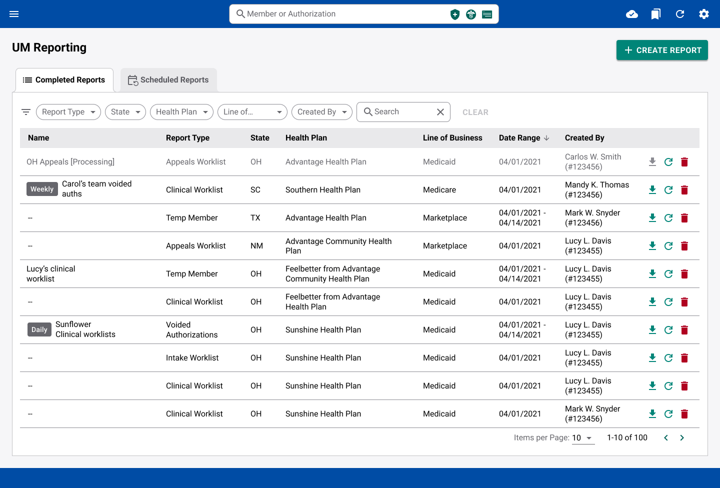
This project was for a Fortune 500 health insurance company serving tens of millions of members across more than 30 states. As the company grew, its legacy claim management software couldn't keep up, so the product team began building a new in-house system from scratch. But as development progressed, users found the new workflows unintuitive and slow, threatening the very productivity gains the rebuild was meant to deliver.
The company was legally required to meet specific claim turnaround times, meaning usability problems had compliance implications in addition to being frustrating and inefficient. I worked with the UX team to conduct heuristic reviews, informal interviews, and usability testing, meeting with stakeholders regularly to communicate findings and keep the design aligned with real user needs.
[Claudia] consistently demonstrated professionalism, creativity, and dedication to her work. Claudia’s contributions to user-centered design were thoughtful and effective, and she was an asset to the projects we undertook.James Bradshaw, UX Manager
Insurance managers used a reporting tool to monitor their team's workloads, tracking how many tasks each person had completed and how many were still pending. To get a report, they filled out a form with the required parameters and generated it manually. The problem was they did this constantly throughout the day. It was repetitive and tedious.
To address this, the product team had already planned two new features without testing: saving report templates and scheduling automatic reports. But when those designs were tested, we discovered a major issue: users couldn't figure out how to use either feature. If the design shipped as-is, it would most likely need to be redone, stalling the enterprise software project and wasting development effort.
Insurance managers struggle to efficiently complete daily reports because the tool's navigation patterns don't match their mental models, leading to slower turnaround times and risk of missed compliance deadlines.
The first thing the team needed to know was what users really needed. To provide a starting point, I conducted user interviews and a heuristic review of the existing designs.
After completing the heuristic review, I ran usability tests with 5 managers and directors, the primary users of this tool. I used UserZoom to test the features for saving a report template and scheduling automatic reports, as well as satisfaction with the report creation form and the report parameters themselves.
"The option to run [a teammate's report] would be helpful."
Manager · New Mexico"It would be nice to have an option to schedule reports to run before the workday begins."
Director · Texas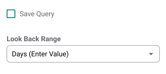
The terms "Look Back Range" and "Query" didn't make sense to 3/5 users.
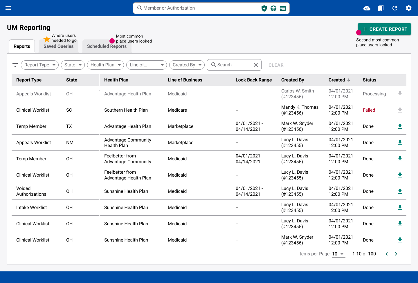 The Original Design
"I don't see anywhere else where I would create a new schedule that's intuitive to me."
Manager · Louisiana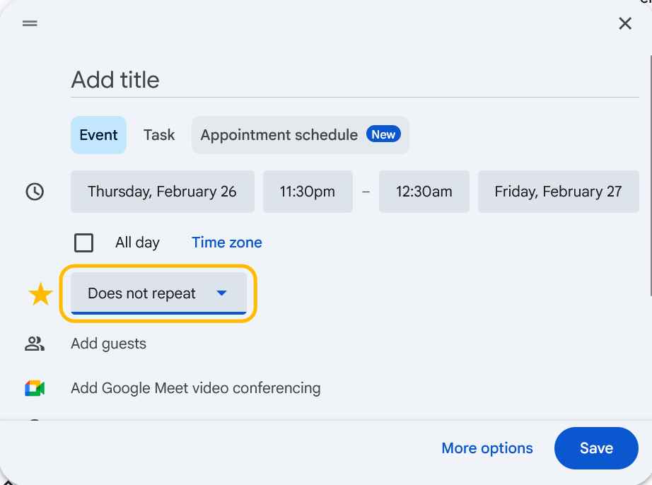 Google Calendar Recurring Event Example
Research confirmed two user types within the management hierarchy.
I mapped a new user flow that matched existing scheduling models such as Google Calendar, where the option to add a schedule was inside the creation form. This would be more intuitive and reduce steps in the flow.
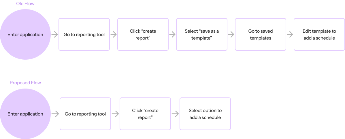 Old vs New Flow diagrams
At this point I adjusted my approach to stakeholder communication due to a UX-immature environment. Stakeholders weren't used to working with UX, which meant recommendations could easily get overridden. To address this, I invited stakeholders to help shape the research plans and observe usability sessions directly. I also started including video clips from usability testing. Seeing users struggle in real time built understanding in a way that a slide deck couldn't.
Each design change was tied directly to a finding from the usability sessions. The goal wasn't to make the interface look better, it was to make the three failing tasks pass at a much higher rate.
The click test showed that users primarily expected to create a schedule in two places: the View Report Schedule section and the Create Report form. I consolidated scheduling directly into the Create Report flow - the more common starting point. This eliminated the hidden dependency on saved templates, reduced clicks, and aligned the interface with how users actually thought about the task.
Create Report screen with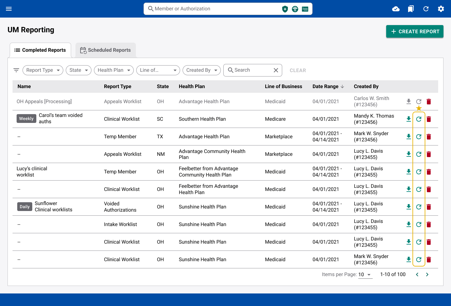 Report action menu with
Users could save report templates, but they consistently failed to find and reuse them in the hidden Saved Queries tab. Instead of trying to make that tab more discoverable, I replaced the concept entirely: a "Re-generate" button in the action menu of each existing report opens the Create Report form pre-filled with that report's parameters. Any report becomes a template with no advance setup required.
New Home page - Completed Reports tab with Schedule column and inline status indicators
Schedule Column
On the Completed Reports tab, users couldn't tell which reports had been auto-generated, creating confusion about where to find them. A dedicated Schedule column replaced redundant fields, making the source of each report immediately clear without cluttering the interface.
Inline Status Indicators
The original Status column was easy to miss. I moved status indicators directly into the report name. Reports in progress appeared greyed out with a "Processing" suffix; failed reports showed an "Error" suffix with a hover tooltip. Placing these on the left aligned with natural reading order, making statuses easier to spot at a glance.
The redesigned flows were validated in follow-up usability testing. Every task that had failed in the original sessions either improved significantly or reached a perfect success rate including scheduling automatic reports, which went from 0/5 to 5/5.
Looking back, there are two decisions I made that I'd approach differently today.
Given more time, I would have redesigned the tool so that upon opening the tool, users could immediately see the most recent report data. They would be able to adjust which data was shown to them in settings. This would eliminate the need to keep re-generating reports throughout the day. For record keeping, users could either save a report of the current data or the system could automatically save reports at set intervals.
Working in a UX-immature environment taught me that trust isn't built through presentations. You have to share ownership. By inviting stakeholders to help shape research plans and observe sessions directly, they became part of the conversation rather than feeling like they're being talked at. That dynamic will make every design conversation easier.